4. January 2023 / English Lightroom Presets
Using Adobe Photoshohp & Lightroom Presets for a consistent Instagram feed
4. January 2023 / English Lightroom Presets
Using Adobe Photoshohp & Lightroom Presets for a consistent Instagram feed
I’m sure you can relate to this problem: you post photos on Instagram regularly, but your feed doesn’t quite look the way you want it to. Maybe the photos don’t match well or the colors are all over the place, making the overall appearance disjointed. As someone who has spent a lot of time trying to create a beautiful and consistent Instagram feed, I want to share some tips and tricks here. It takes some effort, but it’s worth it in the end.
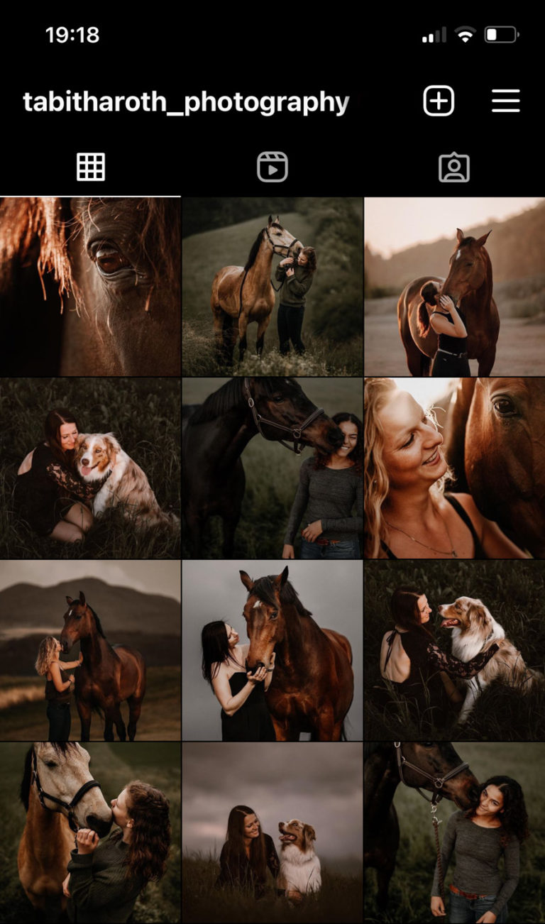
While my feed used to look pretty chaotic at first, I’ve developed some tips and tricks that help me keep it looking appealing, harmonious, and consistent.
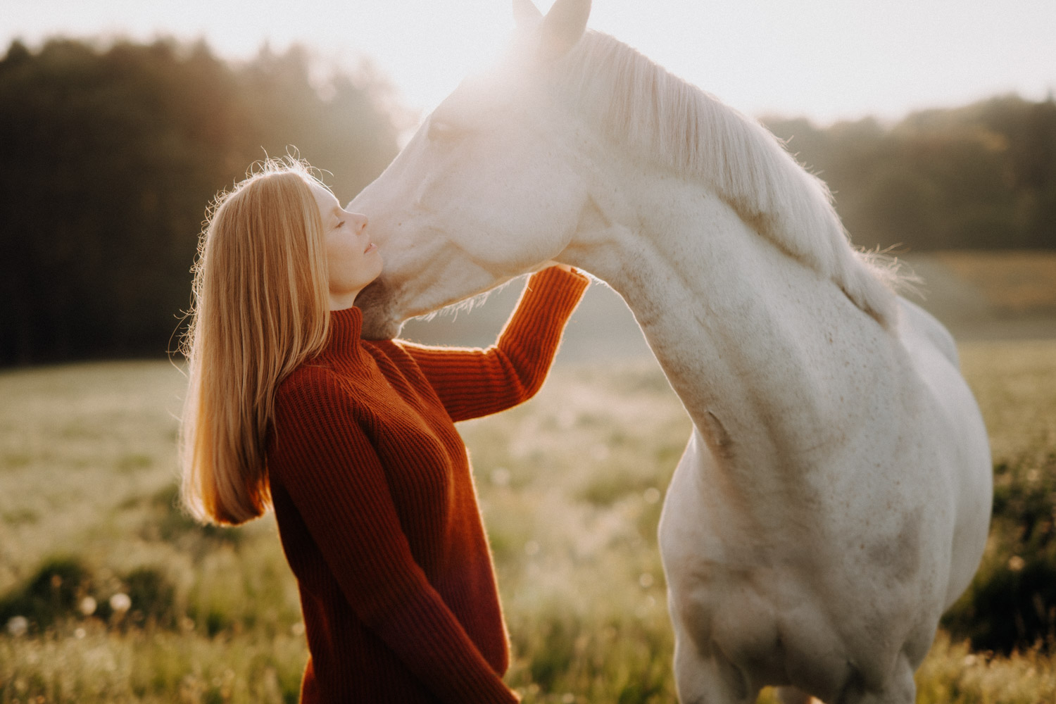
- First, I established some basic rules: I like warm colors, for example shades of brown, orange, olive, and so on. I also prefer high contrast images and darker, heavier tones. Not all of my pictures meet these criteria, but when posting on Instagram, I’m very strict about only selecting pictures that do. For example, I don’t post pictures containig a lot of blue tones. If you have a specific picture that you really want to show even though it doesn’t fit into your feed, you can post it in your story or combine these pictures in a reel. Selecting the right pictures is one of the most important things for maintaining a beautiful and consistent Instagram feed!
- Don’t post all of the pictures from the same photoshoot one after the other; mix it up between different photoshoots! For example, if you have three new series of photos, alternate posting a photo from each of the three series. This creates variety and at the same time ensures regularity and a consistent pattern.
- To create a cohesive look for your Instagram feed, you can use tools like Lightroom to desaturate colors that don’t fit your aesthetic and adjust white balance to shift the overall color scheme in the direction you want. For example, I usually choose to desaturate blue tones and bring out orange, while warming up green tones.
- One way to make your editing process more efficient and ensure that your photos have a consistent look is to use presets in Lightroom. I’ve created my own presets that help me quickly edit my photos in a style that I’ve developed over time and that my clients recognize and appreciate. Presets can be particularly helpful in achieving a consistent look across photos taken in different lighting conditions. They also save me a lot of time, I don’t have to spend hours fiddling with pictures to get them to have a consistent look.
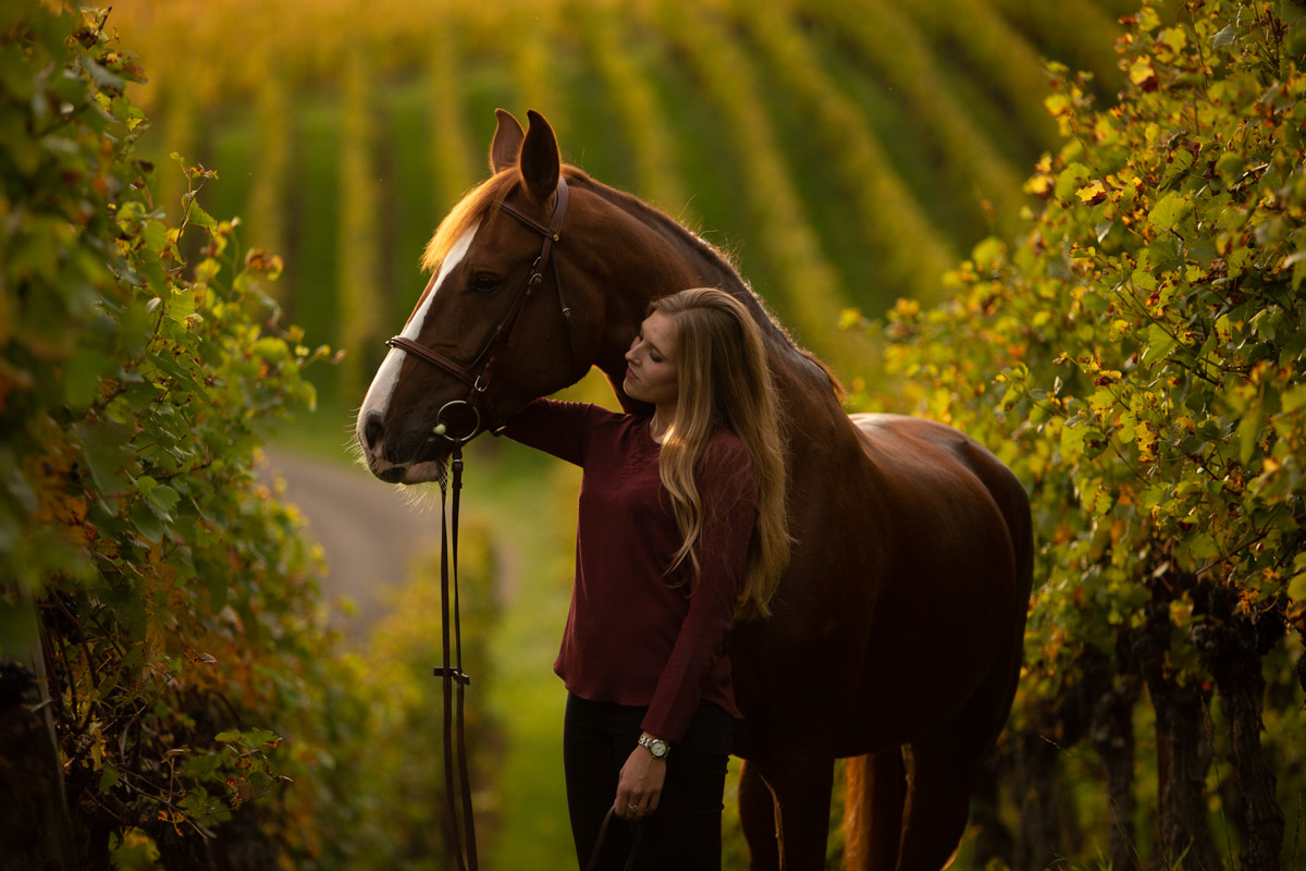
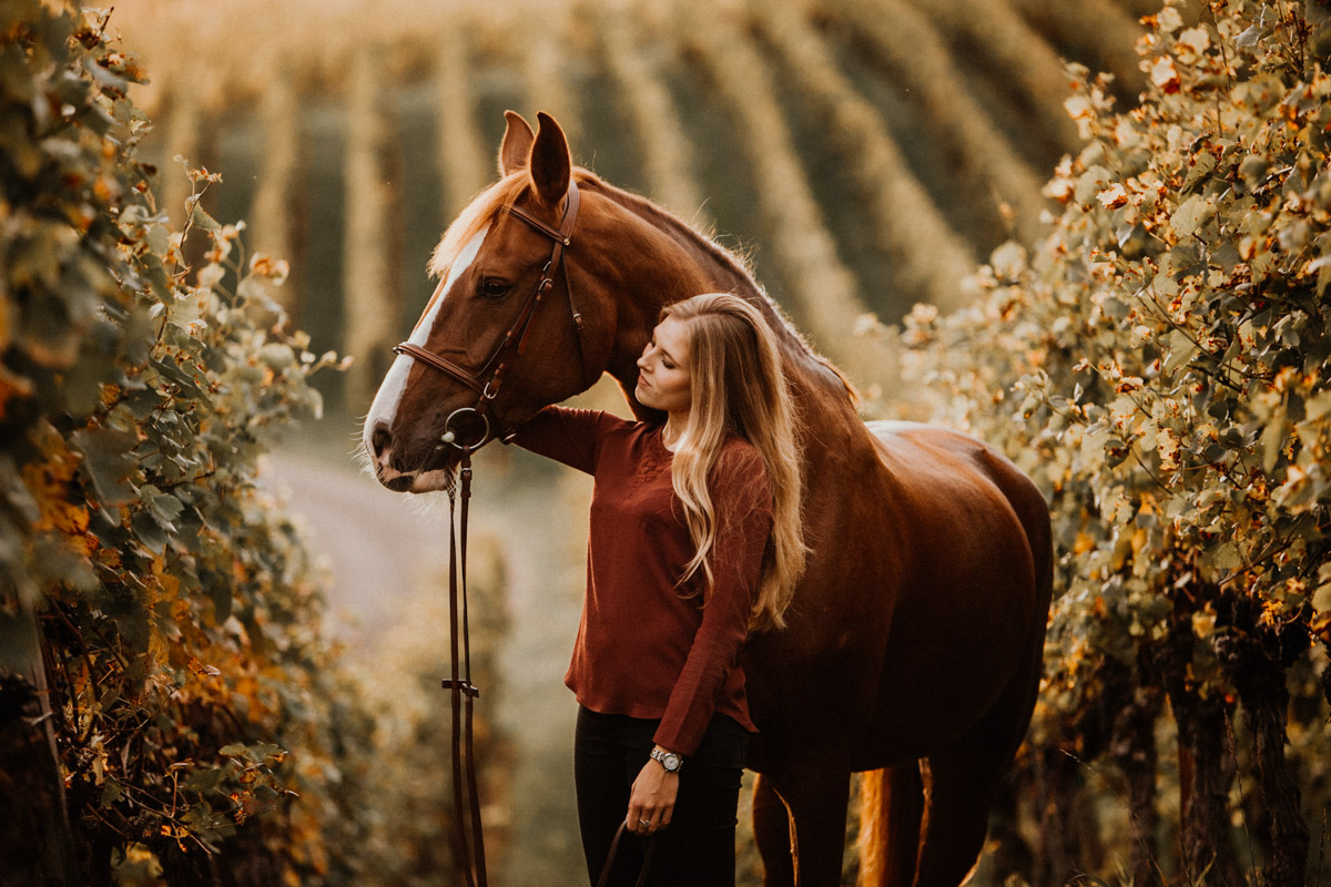
Here are some before-and-after examples using my Lightroom presets. The colors become warmer, the images more contrasty and softer. You can find them in my online shop!